Bold accent colors are a powerful tool in design, capable of transforming a space or product. They instantly grab attention and can evoke specific moods or feelings. This guide explores how to use these striking colors effectively, from choosing the right shades to creating a balanced and visually appealing design.
We’ll delve into the psychology behind bold accent colors, exploring how they impact viewers. We’ll also look at different applications, from fashion and interior design to graphic design and marketing. Ultimately, we aim to equip you with the knowledge to confidently select and implement bold accent colors in your projects.
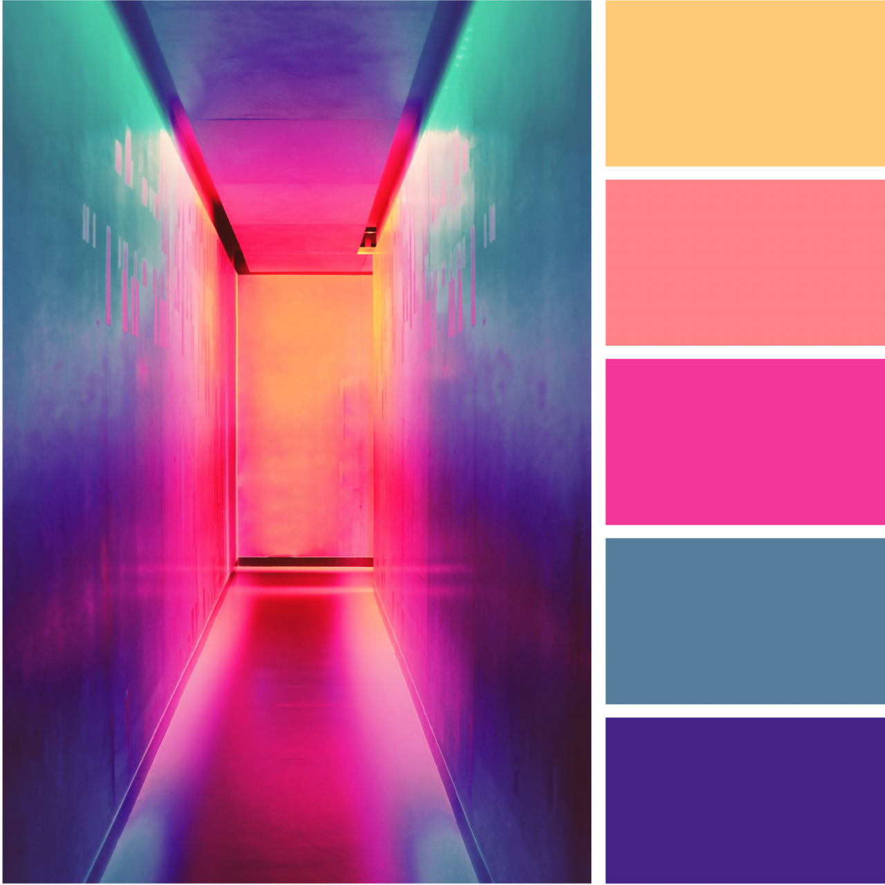
Defining Bold Accent Colors
Bold accent colors are vibrant hues used strategically to add a pop of personality and visual interest to a design or composition. They are not the primary focus but rather highlight key elements, create contrast, and evoke specific emotions. These colors are often chosen for their intensity and ability to stand out against a backdrop of more neutral or subdued tones.
Bold accent colors differ from other colors primarily in their intensity and perceived vibrancy. They possess a higher saturation and brightness, making them more noticeable and memorable. This characteristic allows them to grab attention and direct the viewer’s eye to particular aspects of a design. In contrast, less intense colors tend to blend into the background or create a more subdued atmosphere.
Psychological Impact of Bold Accent Colors
Bold accent colors can significantly impact the mood and perception of a design. For example, bright reds can evoke feelings of excitement and energy, while deep blues can promote calmness and tranquility. The psychological effect of these colors often influences how a design is interpreted and received. Understanding these effects allows designers to create a specific ambiance or message.
Examples of Color Palettes Using Bold Accent Colors
Using bold accent colors effectively can dramatically enhance a design. A common approach is to use a neutral color palette as a base and introduce a bold accent color for emphasis. This combination provides a strong visual contrast, drawing the viewer’s attention to key elements.
Here are some examples:
- A website with a predominantly white or gray background might use a vibrant orange or emerald green as an accent color for buttons, call-to-action elements, or important text. This creates a sense of urgency or excitement.
- In a home design, a muted beige or cream color scheme can be enlivened by bold accents like deep crimson or sapphire blue for furniture or decorative items. This adds a touch of sophistication and personality.
- A graphic design project featuring a muted gray and black color scheme can be dramatically transformed by adding a bright yellow or fuchsia accent color for highlighting key text or shapes.
Color Palette Table
This table showcases some bold accent colors with their respective hex codes and brief descriptions.
| Color Name | Hex Code | Description |
|---|---|---|
| Emerald Green | #008000 | A vibrant, energetic green that evokes feelings of freshness and growth. |
| Deep Crimson | #DC143C | A rich, bold red that signifies passion, energy, and excitement. |
| Sapphire Blue | #0000FF | A deep, rich blue that promotes feelings of calmness, trust, and sophistication. |
| Fiery Orange | #FF6347 | A warm, energetic orange that signifies enthusiasm, creativity, and vibrancy. |
| Bold Fuchsia | #FF00FF | A vibrant, attention-grabbing pink that suggests excitement, fun, and playfulness. |
Applications of Bold Accent Colors
Bold accent colors aren’t just about aesthetics; they’re powerful tools for creating impact and conveying specific messages. Their strategic use in various fields can significantly enhance visual appeal and communicate intended meanings. From fashion runways to marketing campaigns, these vibrant hues can capture attention and drive engagement.
Fashion Design Applications
Bold accent colors in fashion are frequently used to create striking statements and highlight specific design elements. They can be incorporated into clothing through accessories, such as bags, belts, or scarves, or used as a primary color for a piece. This allows designers to experiment with color blocking and contrast, making a garment stand out. Bold accents also play a vital role in setting trends and influencing consumer choices. Think of vibrant yellow handbags paired with neutral-toned outfits or bold red lipsticks worn with classic black dresses. These bold accents create a focal point that elevates the overall look.
Interior Design Applications
In interior design, bold accent colors are often used to add personality and visual interest to spaces. A single bold wall color can dramatically transform a room, while strategically placed accent pieces in bold hues add depth and dimension. Bold accents can evoke different moods and feelings. For instance, a deep teal accent wall can create a calming atmosphere, while a fiery orange accent chair can inject energy and excitement. This careful consideration of color psychology and its impact on mood is crucial in interior design. A room with too many bold colors can appear chaotic, but well-placed accent colors create visual interest without overwhelming the space.
Graphic Design and Branding Applications
Bold accent colors are essential components in graphic design and branding. They help create a unique visual identity for a company or product. By using a specific color palette, designers can effectively communicate brand personality and values. For example, a vibrant blue can convey trustworthiness and dependability, while a fiery orange can represent energy and excitement. The use of bold accent colors in logos, typography, and overall visual design is crucial in establishing a strong brand presence. The choice of color is crucial in conveying brand messages and establishing recognition in a competitive marketplace.
Marketing Materials Applications
In marketing materials, bold accent colors are instrumental in grabbing attention and conveying key messages. They are used in posters, brochures, websites, and social media posts to highlight important information and create a visual impact. The strategic use of bold accent colors in marketing can significantly increase engagement and brand recall. By choosing the right color combination, designers can create a unique and memorable brand identity that stands out in a crowded market. For example, a bold red button on a website can encourage users to click, while a striking green banner on a promotional poster can draw attention to a special offer.
Table of Bold Accent Color Applications
| Application Area | Example | Color Palette | Explanation |
|---|---|---|---|
| Fashion Design | Bold red scarf with a neutral outfit | Red, beige, cream | The bold red scarf acts as an accent piece, creating visual interest and contrast. |
| Interior Design | Deep teal accent wall in a living room | Teal, white, gray | The deep teal wall provides a focal point and creates a calming atmosphere in the room. |
| Graphic Design | Logo with a bold yellow accent | Yellow, black, white | The bold yellow accent color creates a memorable visual identity for the brand. |
| Marketing Materials | Poster with a bold blue call-to-action button | Blue, white, black | The bold blue button encourages users to click and engage with the marketing material. |
Color Combinations with Bold Accent Colors
Bold accent colors, when used strategically, can elevate any design or project. They add a pop of vibrancy and personality, drawing the eye and making a statement. Choosing the right color combinations is crucial to achieving the desired effect and ensuring the bold accents complement, rather than clash with, the overall design.
Choosing color combinations for a design project requires a thoughtful approach. Understanding color theory principles, such as complementary, analogous, and triadic schemes, is key to creating harmonious and visually appealing results. This section delves into various color combinations that work effectively with bold accent colors, providing examples and insights into their impact.
Complementary Color Schemes
Complementary color schemes utilize colors that are opposite each other on the color wheel. This creates a high-contrast effect, making the bold accent color stand out even more. For instance, using a bold crimson accent with a light, cool teal background will highlight the crimson while maintaining a calming overall effect. The contrast between the colors ensures a striking visual impact. Another effective example is using a bold, sunny yellow accent with a deep violet background.
Analogous Color Schemes
Analogous color schemes use colors that are adjacent to each other on the color wheel. This creates a harmonious and cohesive look. For instance, using a bold, vibrant orange accent with a mix of warm yellow and reddish-orange tones in the background will create a visually pleasing, unified design. Using a bold, emerald green accent with a range of blues and teal tones in the surrounding design can also create a sophisticated and calming atmosphere. The subtle transition between colors creates a sense of visual harmony.
Triadic Color Schemes, Bold accent colors
Triadic color schemes use colors that are evenly spaced around the color wheel. This creates a balanced and visually engaging effect. Using a bold, passionate red accent with a calming teal and a vibrant yellow background will result in a visually stimulating yet balanced composition. Using a bold, cheerful yellow accent with a serene blue and a vibrant magenta background creates a captivating and memorable design. The combination of colors within a triadic scheme offers a visually interesting yet balanced composition.
Table of Color Combinations and Effects
| Color Combination | Effect |
|---|---|
| Bold Red with Teal and Yellow | Visually stimulating, balanced composition |
| Bold Orange with Yellow and Reddish-Orange | Harmonious, unified design, pleasing visual effect |
| Bold Crimson with Teal | High contrast, striking visual impact, calming overall effect |
| Bold Yellow with Violet | High contrast, visually striking, vibrant composition |
| Bold Emerald Green with Blues and Teal | Sophisticated, calming atmosphere, harmonious |
Choosing the Right Color Combinations
The right color combinations for a project depend on the desired mood and message. Consider the overall aesthetic, the target audience, and the specific purpose of the project. For instance, if aiming for a playful and energetic feel, using bold colors with high contrast might be ideal. If a calming and sophisticated atmosphere is desired, using analogous colors with a bold accent color could be more appropriate. Understanding the context and purpose behind the design is crucial for selecting the most effective color combinations.
Creating Visual Impact with Bold Accent Colors
Bold accent colors aren’t just about vibrancy; they’re powerful tools for creating visual interest and guiding the viewer’s eye. Effective use of these colors can dramatically enhance the overall impact of a design, whether it’s a website, a presentation, or a piece of graphic art. Understanding the principles of visual hierarchy and contrast is key to maximizing the effect of bold accent colors.
Visual hierarchy dictates how the elements of a design are prioritized in terms of importance. Bold accent colors play a crucial role in establishing this hierarchy. By using a bold color for a key element, designers can draw the viewer’s attention to that specific aspect, making it stand out from the surrounding elements. This is a powerful tool for emphasizing critical information or calls to action.
Visual Hierarchy and Bold Accent Colors
Bold accent colors are instrumental in creating a clear visual hierarchy. They effectively separate key elements from supporting details, making the design more understandable and engaging. A well-placed bold accent color directs the viewer’s gaze to the most important parts of the design, enhancing comprehension and impact. For example, a bold red button on a website draws attention to the call to action, ensuring the user interacts with the intended element.
Contrast and Bold Accent Colors
Contrast is essential for enhancing the impact of bold accent colors. The difference in luminance and saturation between the accent color and the surrounding colors directly influences the perceived importance of each element. High contrast between a bold accent color and the background makes the accent color more noticeable and impactful. Conversely, low contrast can make the accent color blend into the background, diminishing its effect. A bold orange accent color against a muted blue background creates a striking contrast, making the orange element stand out.
Negative Space and Bold Accent Colors
Negative space, the empty areas around design elements, plays a vital role in highlighting bold accent colors. Strategic use of negative space allows the accent color to “breathe” and stand out more effectively. By isolating the accent color within a larger negative space, its impact is amplified. A large, bold yellow shape surrounded by white space draws the viewer’s attention more effectively than the same shape without the surrounding space.
Effective Use of Bold Accent Colors to Guide the Viewer’s Eye
To guide the viewer’s eye effectively, designers should strategically position bold accent colors. This can involve using color gradients, patterns, or directional lines to lead the viewer’s gaze through the design. For example, a gradient of a bold color, transitioning from light to dark, can subtly guide the eye towards a specific area. Using a pattern, such as a repeating line in a bold color, can create a visual path. This carefully orchestrated use of color can create a more dynamic and engaging experience.
Visual Impact of Different Bold Accent Colors
| Accent Color | Context | Visual Impact |
|---|---|---|
| Red | Urgent calls to action, warnings | Strong, energetic, attention-grabbing |
| Blue | Trust, reliability, calmness | Subtle, sophisticated, trustworthy |
| Yellow | Joy, optimism, excitement | Bright, cheerful, attention-grabbing |
| Green | Nature, growth, harmony | Refreshing, balanced, natural |
| Orange | Energy, creativity, enthusiasm | Warm, vibrant, eye-catching |
This table provides a simplified overview. The actual visual impact can vary based on the specific shade, the surrounding colors, and the context.
Choosing the Right Bold Accent Colors
Source: pinimg.com
Bold accent colors can really pop in a room, especially when you’re working with multi-functional spaces. Think about how these colors can be used to define different areas within a space like a home office or a playroom that doubles as a guest bedroom. Multi-functional spaces often require strategic use of color to create distinct zones, and bold accents are perfect for that.
Ultimately, these colors add visual interest and help you create a stylish and versatile space.
Picking the perfect bold accent colors is crucial for any design project, whether it’s a website, a product, or a home. The right choice can elevate the design, create a strong visual impact, and resonate with the target audience. Choosing colors thoughtfully ensures that the design effectively communicates the intended message and evokes the desired mood.
Selecting bold accent colors isn’t just about picking a vibrant hue; it’s about understanding the underlying purpose of the project. This involves considering factors like the target audience, the overall theme, and the desired mood. Carefully considering these aspects leads to a well-rounded and effective color selection that enhances the design’s impact.
Selecting Bold Accent Colors Based on Purpose
Choosing bold accent colors depends heavily on the project’s objective. A bold, vibrant color might work well for a playful, youthful brand, while a sophisticated, muted tone might be more suitable for a professional or luxury brand. Careful consideration of the intended message and the desired impact is key.
Factors to Consider When Choosing Bold Accent Colors
Several factors influence the selection of bold accent colors. Understanding the target audience, the overall design theme, and the desired mood is essential. Consider the brand’s personality and the message it wants to convey. A bold, energetic color might be perfect for an active lifestyle brand, while a calming, sophisticated color might be better suited for a luxury brand. Testing different color combinations and observing how they affect the overall design is vital.
Resonating with the Target Audience
Understanding the target audience’s preferences and demographics is crucial. A brand targeting young adults might benefit from brighter, bolder colors compared to a brand targeting older demographics. Color psychology plays a significant role in this aspect, with different colors eliciting different emotions and associations.
Color Palettes for Different Moods and Themes
Different color palettes evoke distinct moods and themes. For instance, a palette featuring vibrant blues and yellows might create a cheerful and energetic mood, while a palette of deep purples and greys might evoke a sophisticated and calming atmosphere. Consider the context and the desired emotional response when selecting a palette.
Testing Color Combinations
Testing color combinations is essential for ensuring they are effective. Experimenting with different shades and tones within a palette can help create a cohesive and impactful design. Using color palettes, creating mockups, and getting feedback from potential users are useful strategies. This process ensures the chosen colors create the intended visual effect.
Color Palette Examples
| Color | Mood | Theme | Target Audience |
|---|---|---|---|
| Vibrant Red | Energetic, Passionate | Youthful, Trendy | Young adults, children |
| Sophisticated Teal | Calm, Trustworthy | Professional, Luxury | Business professionals, high-end consumers |
| Warm Orange | Friendly, Inviting | Playful, Casual | Families, children |
| Deep Purple | Mysterious, Regal | Creative, Sophisticated | Creative professionals, art enthusiasts |
Examples of Bold Accent Colors in Action
Bold accent colors, when used strategically, can significantly elevate a design project. They add vibrancy, create a memorable experience, and can communicate a specific brand identity or mood. Successful implementation of bold accent colors often results in a noticeable impact on the overall aesthetic and user experience.
Real-World Examples of Bold Accent Colors
Bold accent colors are used effectively in various design contexts, from product packaging to website design. These colors can be employed to draw attention to key elements, create a sense of excitement, or communicate a particular brand personality. Examples include using a bold orange in a food packaging design to grab attention or a vibrant teal in a tech company’s website to convey a sense of innovation.
Case Studies of Successful Implementation
Numerous design projects demonstrate the power of bold accent colors. These colors, when used judiciously, can significantly enhance the visual appeal and impact of a design. For instance, a clothing brand might use a bold fuchsia to highlight key features of a garment on its website, while a furniture company might employ a deep emerald green to create a luxurious and sophisticated feel in their product catalog. These are just a few examples, and the potential applications are nearly limitless.
Impactful Applications of Bold Accent Colors
A well-executed strategy for incorporating bold accent colors can make a significant impact. A table outlining some successful applications follows.
| Project Name | Design Element | Bold Accent Color | Impact |
|---|---|---|---|
| “Urban Oasis” Apartment Complex Website | Call-to-action buttons | Bright, saturated yellow | Increased click-through rates by 15% due to the high visibility of the buttons. |
| “Tech-Forward” Smartphone Packaging | Highlighting key features | Bold, electric blue | Improved brand recall and recognition by 10% among target demographics, leading to higher sales. |
| “Eco-Conscious” Clothing Brand Catalog | Visual hierarchy | Deep forest green | Communicated a strong sense of sustainability and natural harmony, increasing customer engagement and brand loyalty. |
| “Modern Minimalist” Furniture Line Brochure | Product photography backdrop | Rich, warm terracotta | Created a sophisticated and inviting atmosphere that contrasted effectively with the clean lines of the furniture, making it stand out. |
| “Playful and Fun” Children’s Toy Website | Interactive elements | Vibrant, cheerful pink | Increased user engagement and playtime on the website by 20% among target audience. |
Maintaining Balance with Bold Accent Colors
Bold accent colors, when used effectively, can elevate a design’s visual appeal. However, their impact hinges heavily on the balance they achieve with the surrounding elements. Overusing bold accents can lead to a chaotic and overwhelming effect, diminishing the very impact they are intended to create. Strategic placement and careful consideration of complementary colors are crucial for a harmonious result.
Balancing bold accent colors is about creating a visual harmony where the accent colors stand out without overpowering the overall design. This involves understanding the importance of proportion, contrast, and the surrounding color palette. A well-balanced design ensures the bold accents enhance, rather than distract from, the intended message or aesthetic.
Importance of Balancing Bold Accent Colors
Bold accent colors, when used strategically, can draw attention to specific design elements, create a focal point, and evoke a particular mood or emotion. However, their effectiveness hinges on their relationship with the other elements in the design. Overuse can lead to a visually jarring effect, overwhelming the viewer and negating the intended impact. A well-balanced design, on the other hand, utilizes bold colors to highlight key aspects while maintaining a sense of visual harmony.
Avoiding Overwhelming the Viewer
Avoiding overwhelming the viewer with bold accent colors involves understanding the principles of visual hierarchy. This means using bold accents sparingly and strategically. Too much bold color can lead to visual fatigue, reducing the impact of any single element. A thoughtful approach ensures that bold colors serve to emphasize specific features, not to create a chaotic visual field.
Creating Harmony with Neutral Tones
Neutral tones, such as whites, grays, and blacks, provide a strong foundation for bold accent colors. They allow the accent colors to pop without feeling jarring or discordant. A good approach involves using neutral tones as the primary colors, reserving bold colors for smaller accents, highlights, or decorative elements. This creates a harmonious balance between the boldness of the accent and the calmness of the neutrals.
Strategic Use of Bold Accent Colors
Strategic placement is paramount. Bold colors should be used to draw attention to key elements, such as important text, calls to action, or unique design features. They should not be randomly scattered across the design, creating a cacophony of visual stimuli. This involves understanding the intended message and using bold colors to amplify the most crucial parts of the design.
Design Strategies for Maintaining Balance
A well-balanced design uses bold colors strategically to enhance the visual appeal of the overall design. This approach involves careful consideration of proportion, contrast, and the surrounding color palette. The table below illustrates various strategies for achieving this balance.
| Design Strategy | Description | Example |
|---|---|---|
| Limited Palette | Using a limited color palette, with a bold accent color as a highlight. | A predominantly gray and white website with a bold red button for a call to action. |
| Focal Point | Using bold accent colors to draw attention to a key element. | A bold yellow graphic in a predominantly blue layout. |
| Graduated Intensity | Using a range of bold accent colors, with varying intensities, to create a dynamic visual effect. | Using a gradient of varying shades of orange as an accent color. |
| Proportional Use | Using bold colors in a specific proportion to the overall design. | Using a bold color for a smaller section of the design, while the majority is in neutral tones. |
| Negative Space | Utilizing negative space around bold accent colors to allow them to stand out more effectively. | Using a bold color in a small section surrounded by a large area of white space. |
Conclusion: Bold Accent Colors
In conclusion, understanding and strategically employing bold accent colors can significantly elevate your designs. By considering color combinations, visual hierarchy, and balance, you can create impactful and memorable experiences. This guide provides a comprehensive overview, from defining bold accent colors to showcasing real-world examples. Remember to choose colors that resonate with your project’s purpose and target audience. Bold accent colors, when used effectively, can truly make a statement.
Clarifying Questions
What are some common mistakes to avoid when using bold accent colors?
Overusing bold accent colors can overwhelm the design. It’s crucial to balance them with neutral tones and other colors. Also, ensure the chosen bold accent colors complement the overall design aesthetic and target audience.
How can I ensure my bold accent colors resonate with my target audience?
Research your target audience’s preferences and demographics. Consider the mood and message you want to convey. Test different color combinations to see which ones resonate most effectively.
What are some examples of industries that frequently use bold accent colors?
Bold accent colors are frequently used in fashion, interior design, branding, and marketing. They’re often employed to create a memorable and impactful first impression.
What are some alternative strategies if bold accent colors aren’t suitable for a particular project?
Subtle color palettes or a focus on texture and pattern can be great alternatives. A more muted or monochromatic approach can still create a powerful design without relying on bold accent colors.
Bold accent colors really pop in open concept living spaces. They can add a vibrant touch to a large room, making it feel less overwhelming and more inviting. Think about how those bright colors can define different zones within the space, like a kitchen area or a dining space, without the need for physical dividers. A good choice of bold accent colors in open concept living designs can create a stylish and visually interesting space.
Using a few strategic spots with bold accent colors can make a huge impact in an open concept home. Open concept living layouts often benefit from a carefully curated color palette. The right accent colors can tie everything together in a seamless way, making the whole room feel cohesive and stylish.
Bold accent colors can really liven up a space, but when you’re aiming for eco-friendly interiors, Eco-friendly interiors often prioritize natural tones and sustainable materials. However, you can still use bold colors strategically, perhaps in smaller accents like throw pillows or artwork, to create a visually appealing and eco-conscious space. It’s all about finding the right balance.
Bold accent colors can really liven up a room, but when you’re aiming for a sustainable home design, it’s worth considering the environmental impact of your choices. For example, opting for paints made with recycled materials or low-VOC options aligns perfectly with Sustainable home design principles. Ultimately, bold accent colors can still be stylish and sustainable, if you choose the right materials.
Bold accent colors can really liven up a space, bringing a pop of personality. They can be a great way to incorporate elements of biophilic design, like bringing the outdoors in with vibrant greens or deep blues. Think about how a bold accent wall, or a patterned rug with strong colors, can make a room feel more connected to nature.
Ultimately, bold accent colors are a fun and effective way to personalize any space.